Set Your Goal

You want to be effective in digital ministry. Set SMART goals. (Specific, Measurable, Achievable, Relevant and Timely).

Know Your Audience

How to create a persona, based on research, educated assumptions, and real experiences. to help you in digital ministry.

Social Media Basics

Best practices and key tips as you get started in the world of social media for ministry.

Create a Journey

A content journey is taking your user through a digital journey, step-by-step, going from one call to action (CTA) to another.

Intro to Analytics

Analytics can help you see where God is at work in people’s lives online, and evaluate the effectiveness of your digital efforts.

Put It All Together

Final instructions for a new digital strategist.

Marketing to Expand Your Reach

This section provides training and resources to help you grow in your marketing capabilities.

Analytics

Find playbooks for using and leading with analytics, webinars, and step-by-step guides for using our Cru analytics tools.

Social Media Management

Find training and how-tos for managing your social media channels as well as running social media campaigns.

Email Campaign Management

Find helpful resources to help you get started with Adobe Campaign and to run your first email campaign.

Content Management Systems

Cru supports two content management systems that can host your website: Adobe Experience Manager (AEM) and WordPress.

Learning Management Systems

Find helpful resources to help you get started with the right Learning Management System (LMS) to fit your training needs.

Downloads

Worksheets and diagrams to help you plan your strategy

Glossary

What does THAT mean? Find the answer here!

Measuring Fruitfulness

How we define and measure fruitfulness in the digital ministry context

Cru Digital Ecosystem

Directory of the supported apps and sites we use for ministry

Components

Blade and Blade Multifield


This is by far one of the most widely utilized components, mainly for how much it offers inside of one component. This is really two components, but we are grouping them together due to the similarities. 


The Blade/blade multifield component (I’ll say  Blade for short) can currently be used on several templates. 


Here are the main action points of each:

Blade

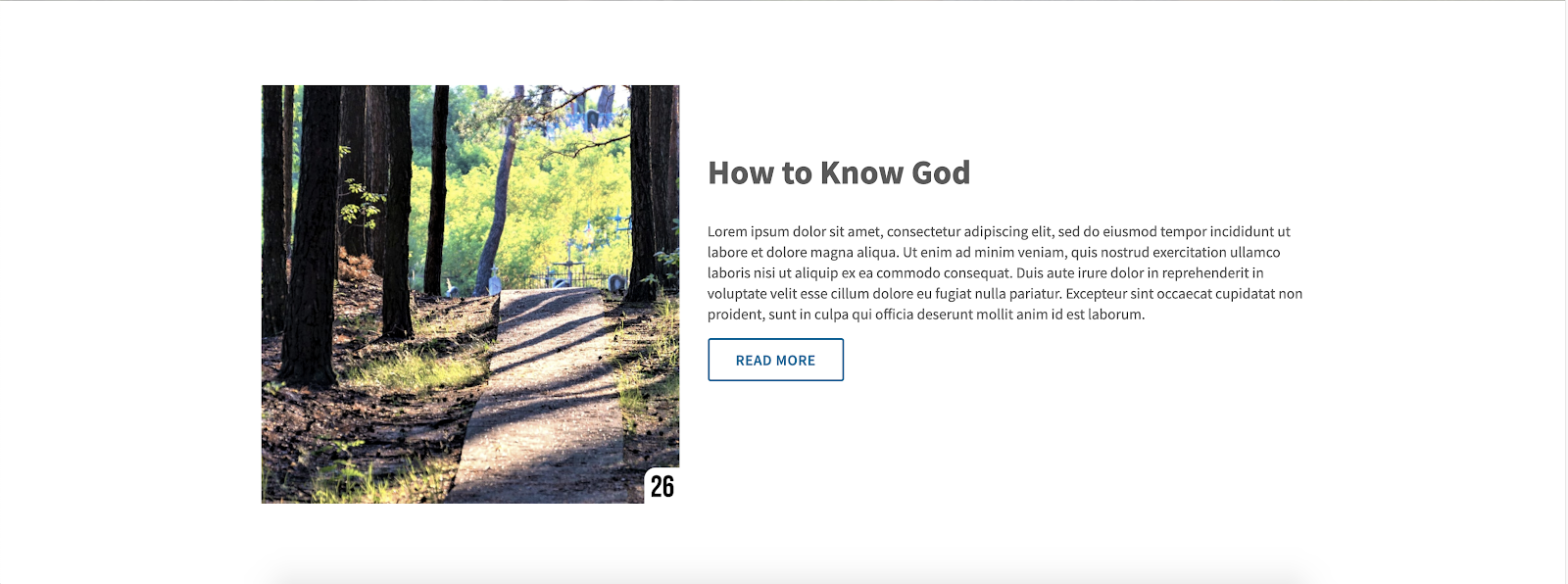
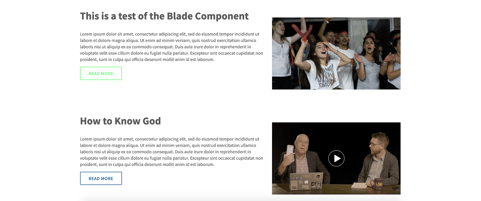
  • Content -- Title, Description, Image, Image Alt Text, Video URL

  • Button -- Button Link, Button Text, Button Style, Button colors

  • Theme -- Image on the Left, text color, background color, padding
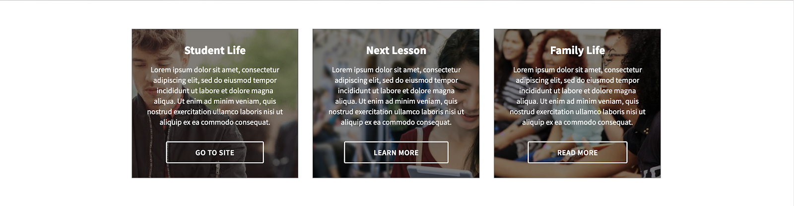
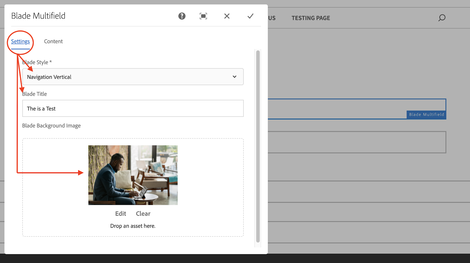
 

Blade Multifield

  • Settings

    • Blade Styles -- Column List, Column CTA, Column CTA Boxes, Navigation Vertical, Navigation Horizontal

    • Blade Background Image

  • Content

    • Ability to add multiple items

    • Navigable Title

    • Title

    • Description

    • Link Path

    • Link Label

Depending on the configurations you make to the component, you can get quality visuals.


Blade Multifield Component - Navigation Horizontal


Blade Component


Blade Multfield -- Column List (this is the most basic style)


2 Blade Components, showing different options


Blade Multifield --  Column CTA


Blade Multifield -- Column CTA Boxes


Blade Multifield -- Navigation Vertical


Here are the steps we took to get the Navigation vertical style layout.

  1. Create a new page (or use an existing page) that is based on either the Content Page Template or the Landing Page Template

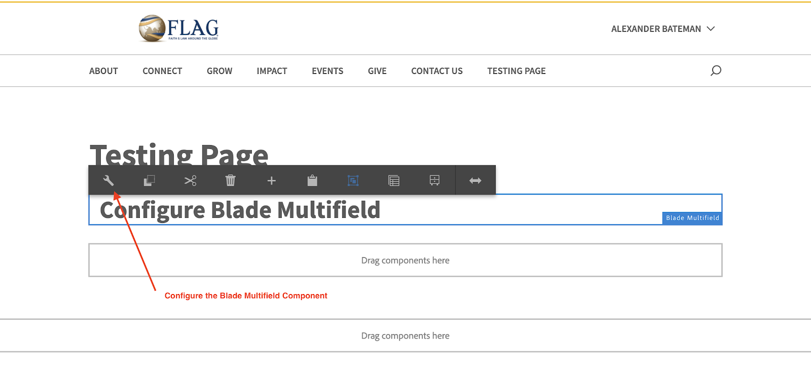
  2. Click on “Drag Component Here” and then click on the “+” icon to pull up a list of available components


3. From the “Insert New Component” list, select “Blade Multifield”

4. You should now have a plain white box added to your page. This is your Blade Multifield that you can now begin to configure.

5. The “Settings” tab allows you to configure the Style and Title of the component, as well as add a background image to the component

6. The Content tab allows you to add different sections of the Blade Multifield, we’ll be adding 3 separate items for this example.Click Add under the Items section.


Make sure you fill out each of the boxes under the Content tab. The Navigable Title allows the user to go between the items. When all 3 of the items are filled out, this is what the final product of your work will look like. Since we went over one of the more complex versions of the component, we will not be covering all of the other styles. 


Previous Story

Dynamic Media

Next Story

Container

©1994-2022 Cru. All Rights Reserved.